18 november 2013

An idea from 1934

Peter Miebies drew my attention to a card to announce a change of address, from the Netherlands Indies. The country nowadays is called Indonesia, BTW. What struck me on this card was the font, or should I say 2 fonts, because the lettering on the printed "stamp" is a bit different from the font on the card itself.


This seems good material to work into a new font. I'll let it simmer for a while, and see what comes out.

Update:
The stamp on the card was preprinted, apart from that the postal service also sold individual stamps, with the same theme. Different colours for different values of the stamps. They look like this:

(picture found on website catawiki.nl)

20 augustus 2013

Challenge - update 1

Presenting the first result of trying to capture the lettering in Amsterdam. Some letters still need some tweaking, but the overall appearance seems satisfying. At least, that's what I think.


Perhaps it is nice to have a 'filled' space as well, where the bottom of the characters runs through. Maybe I will sacrifice the pipe-character (|) for that. That should look somewhat like this, then:


Just fooling around I stumbled on the new embedded version of WordArt in Word. The combination with my new font is nice:


Okay, variation on a theme gives the following result:


To answer a question about the letter Q, I solved it like this:


But perhaps it could be a little more pronounced. There is room within the character envelope to do that. Having said that, it was time to get back to the drawingboard. After some tweaking the result now looks like this:


29 juli 2013

A real challenge from Amsterdam


These ornaments can be found in Amsterdam. They are part of a small transformerbuilding (I guess) that belongs to the electricity company. The characters were painted over several times, creating an artistic effect.

I plan to transform this into a peculiar font, based on the viscosity of lubricating oil. Curious? You should be, because I am too. No telling what the result will look like.

BTW: the 3 ornaments spell the year that the building was built: ANNO 19 27

16 juli 2013

The word "bad" has different meanings in Dutch and English...

Work has started on a new font, inspired by "Het Sportfondsenbad" in the eastern part of Amsterdam. In this case "bad" doesn't mean bad, but it stands for "pool". That's why the font will not be named Mokum Bad, but Mokum Plons. Plons is Dutch for "splash". I rejected Mokum Pool for roughly the same reason, because Pool in Dutch stands for "inhabitant of Poland".

The inspiration
The text Het Sportfondsenbad has been cut from a thick sheet of steel*). The name was first bolted to the wall of the building that houses the pool. Over the years this building was altered, refurbished and such. Consequently the lettering was taken from the wall, remounted et cetera. This caused some damage. A couple of years ago the text looked like this:


It seemed interesting and one day I went to Amsterdam to take a better look. This is part of what I saw:


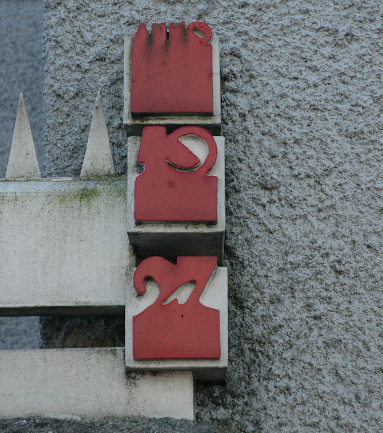
And somewhat further to the right there was this:


The bottom of the letters was rusted and then covered in paint. But it survived several decades, that's the main thing. The characters look deviously simple, which I found out when I did my best to copy some of them. That first try looked horrible, and the font-to-be was put on hold. In the meantime there appeared a book on alphabets in Amsterdam, on the cover of which the Sportfondsenbad was prominently featured. If you do not know that book, look at the following picture, where you see yours truly holding it:


The font now lies on the drawing board. It still needs some tweaking & fiddling, but:


*) Update #1
I have to revise my earlier thoughts, since the letters are oxydized at the sides they were probably not made from steel. Rather, they were cut from a sheet of iron. Stainless steel was available when the tekst was made, but ir probably was too expensive. A good coating of primer or poisonous leadoxyde were enough to keep the metal from rusting. Several layers of paint gave the finishing touch.


07 juni 2013

How about mangled upper case?

Okay, some fonts are a bit less conventional than others. And when you're reviving old typefaces you can run into some strange characters (pun intended, of course). This time I came across two weird versions of the upper case "R'. The first was seen on an old dairy factory, in Dutch "ZUIVELFABRIEK DE SOESTER".


The "S" is very intriguing, but what about the "P with an extra stroke"? This should be an "R"?

Example number 2 is to be found in Amsterdam, on the front of an old pharmacy. The text reads "DE RUYTER APOTHEEK", but see for yourself:


This is a "D" with an extra stroke, to turn it into an "R". Should I stick to the original, or should I tweak the R a bit? In other words: would you be confused, reading the original lettering or not?

01 juni 2013

Typography and pottery

This will be a hilarious story, but first let me begin with an example from archaeology. Suppose you are digging and you find some shards of pottery. You look at them and decide to reconstruct the original object. So you go from shards to pot. That pot breaks after a while, it gets discarded and later on someone else finds some shards. He decides to clean them, and reconstruct the original object. Sound familiar? Yes, but be prepared for a surprise:


The shards get reconstructed into a piece of pottery. When a fragment of that pot is found later on, it gets reconstructed to an amphora. It is still pottery, but somewhat different.

I noticed something similar in typography. Yours truly, while digging, found a fragment of text that was made by graphic designer Fré Cohen. I decided to reconstruct those fragments into a font. In due course the font was used for the book Versteende Welvaart (Petrified Prosperity) dealing with architecture in the Dutch province of Groningen. A flyer was made, to invite people to the official introduction of the book. That flyer was found by a designer, and from those shards of the alphabet he decided to reconstruct the orginal font. In pictures, this boils down to:


Fré Cohen designed the word "VERSLAG", which I extended to a whole alphabet. Artist Frits Jonker saw a fragment "VERSTEENDE WELVAART" and extended that to a complete alphabet. You cannot imagine these things, they just happen. And I'm glad they do!

03 mei 2013

Preliminary version of font SCHIP


This is a prototype of the new font. It is modelled after the original lettering in the old post office in complex Het Schip in Amsterdam. To give an idea, in the next picture you see the top of a phone booth (telefooncel in Dutch) with the word TELEFOONCEL. Now you know where the characteristic E and F come from.


The text is chiseled out of the wooden doorframe of the phone booth. The whole booth is depicted in the next image:


There is still a lot of work to be done, because the G is top-heavy, the 8 is not what I want and the 3 is cumbersome, to say the least. I will also try to design a leaner S and T, matching better with the E. And... but you be the judge and tell me what you think. (Click on the images to see a bigger version on screen).

Comments are welcome!


20 april 2013

A new font in the making


This is a preview of the new font that I'm currently working on. It is derived from the lettering in the post office of building complex Het Schip in Amstertdam. The name is Dutch for "The Ship" and the complex looks indeed a bit like a ship, plowing its way through the ocean.
Part of Het Schip is a museum, and they have a magnificent website. Take a look.

Before I forget, my new tool is indeed FontForge, an open source program developed primarily by George Williams. It takes a little getting used to but after that learning curve is over it's very nice to work with.