

This letter was photographed by John Williams PhD from Los Angeles. The letter B stands for Buffum, as in Buffum Elementary School. The school was named after Dorothy Buffum Chandler (1901-1997) a Los Angeles cultural leader.
I saw the picture on Flickr and my first thought was: this should be mage into a font. Unfortunately there is only this B and nothing else. So the design will have to be made from scratch:

Well, what has to be done, has to be done. The frist thing to do is brush up the B a little, so that it may serve as a template for a complete alphabet. After some twiddling I arrived at:

This looks nice, although I may have tried to round the design a bit too much. For starters this seems OK, but I'll give it some more thought.
Update 1 The first glimpse of the new design. The H is too unclear and the I possibly a little too bold and that O should probably get rid of the flat top and bottom.
Update 1 - As promised the design has been simmering during the week and after a very interesting conversation about typography yesterday evening over a plate of perfect tempura, this is the 2nd result:

Maybe the E and F need some more width, I'll experiment a little with that option. A test with a middle stroke of the E sticking out was abandoned rather quickly. That meant I had to do someting similar to the F, making that character top-heavy.
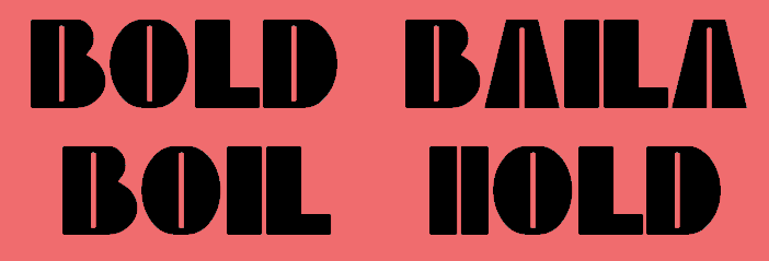
And yes, I tested the new font with the dreadfull "HiHo", as sung by Snowwhite's 7 dwarfs. That looked like this:
