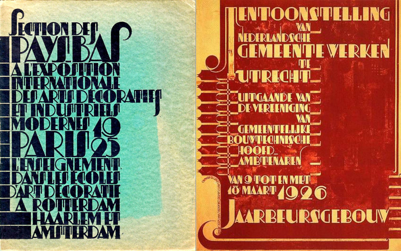
Tuesday, May 19, 2009

Agony!

Wandering through Amsterdam I saw this beauty. A (presumably concrete) letterbox, with an awesome font.


This litteraly screams to have a complete alphabet fashioned around it, but I can sense problems around the corner. The word POST was clearly constructed to fit in this combination and not another. The kerning between the O and S is great, but it destroyes the S for other purposes. Try to imagine the combination TS without tweaking the shape of the S.
You can see I have a small problem here.

Thursday, February 12, 2009

Descending Upper Case...

An interesting idea, not to let upper case and lower case share the same baseline. Just let them hang from the same "clothesline", so to speak, and you get:


This looks promising, although there are still some quirks. For instance *is* is a good idea to let some upper case characters peek above the x-height? Or should the whole uppercase set dive even lower, like the S in the original lettering on the entrance in Zuidlaren? I have to bear in mind that people will actually use this font so the deviations from the norm cannot be too big. I'll do some puzzling over the weekend.

Update #1:
First result of the puzzling. This image is stored as a GIF-file, so there aro no JPG artifacts that could spoil the image (like the one above):


Update #2:
I did not quite like the letter Q, so I changed the design. Borrowing some elements from the R gives a much more pleasing image. Judge for yourself:


Update #3:
This follows a suggestion made by Bill, to omit the 'serif' on top of the E and F. You may also call it a flagstaff, and the initial idea was to create more height in the upper case.

Monday, February 09, 2009

Fun in the sanatorium

I have stopped working on the Esserveld font for the time being. It has to mature a little bit more. In the meantime I'll do some work on the new font Mokum Sana, derived from the lettering on the gate of the old sanatorium in Zuidlaren, Netherlands. To give you an impression:


These are the lower case characters, next in line is the upper case. Like the original wrought iron letters, they will descend below the baseline. I'm still trying to figure out the best way to do that. Possibly they will rise above the x-height as well, creating room for the diacritics.
Here is the whole set. They look like upper case, but I'm using them as lower case. The upper case will look more like drop caps (like the miniatures in Medieval manuscripts).


And as always: your input is highly valued!

Tuesday, January 27, 2009

Inspiration from Zuidlaren

Zuidlaren is a nice village in the woods just south of Groningen. Driving through the village my eye caught a glimpse of a truly impressive building. A little further down the road I saw the entrance:


The strongly kerned pair OO draws the attention immediately and the other characters are also promising. A new font is in the making. The genius behind all this was architect Egbert Reitsma, who drew the plans for this sanatorium around 1928. To get a better view of the letters, here is a compilation in close-up:


The text was made from forged iron or steel, using a continuous strip for each character. With the exception of the letter T, that was made by welding to pieces together. Whether this will survive in the ultimate font, I don't know yet. Have to do some testing, possibly altering the vertical position of the different elements.

Sunday, January 25, 2009

A better look at Esserveld

I decided to go and see this cemetary myself. Pictures found on the internet are nice, but they do not show everything. So my wife and I went to Groningen (in the pouring rain) to take some new pictures of the entrance gate:


And guess what? The characters are truly 3D, with a rounded bevel and cutouts that look as if they were made by a chisel in stead of a saw. This means I will have to rethink the base of the font. In other words: back to the drawingboard.

Monday, December 29, 2008

News from Esserveld

The holiday season proved benificial for my new font. I talked a lot, made sketches and waited for some "brainwaves" and all that resulted in a partially overhauled font:


The X, Y and Z are still problem children, and the same is true for the O and Q. The K seems promising, but it's not quite what I want. The H could use an ellipse, probably on the right side. I'll tinker with that. As always: if you have a comment, don't hesitate to share it with me.

Sunday, December 21, 2008

Help is much appreciated

I'm keeping my focus on the northern part of The Netherlands for a while, getting inspiration from all the fascinating buildings over there. One that caught my eye was the Esserveld cemetery, of which I present this picture of the entrance building:


Notice the lettering that was used for the name. This just HAS to be transformed into a font. First impression: "Hey, piece of cake, I'll do that in a couple of hours..."
Yeah! But then the second impression: "Whoa! This is really complicated", followed after a short while by impression number three: "Gosh, what did I do? How do I get out of this trap?"
First thing I did was recreate the E, S, R, V, L and D, with a little tweaking, like the stem of the R. Then, the rest of the uppercase set was made, as can be seen here:


And this is where the public comes in (I hope). Please let me know which of the letters you find the 'odd ones out'. I have some ideas myself, but in order not to influence anyone I keep my mouth shut for the time being. Please put a comment underneath.